Iliana
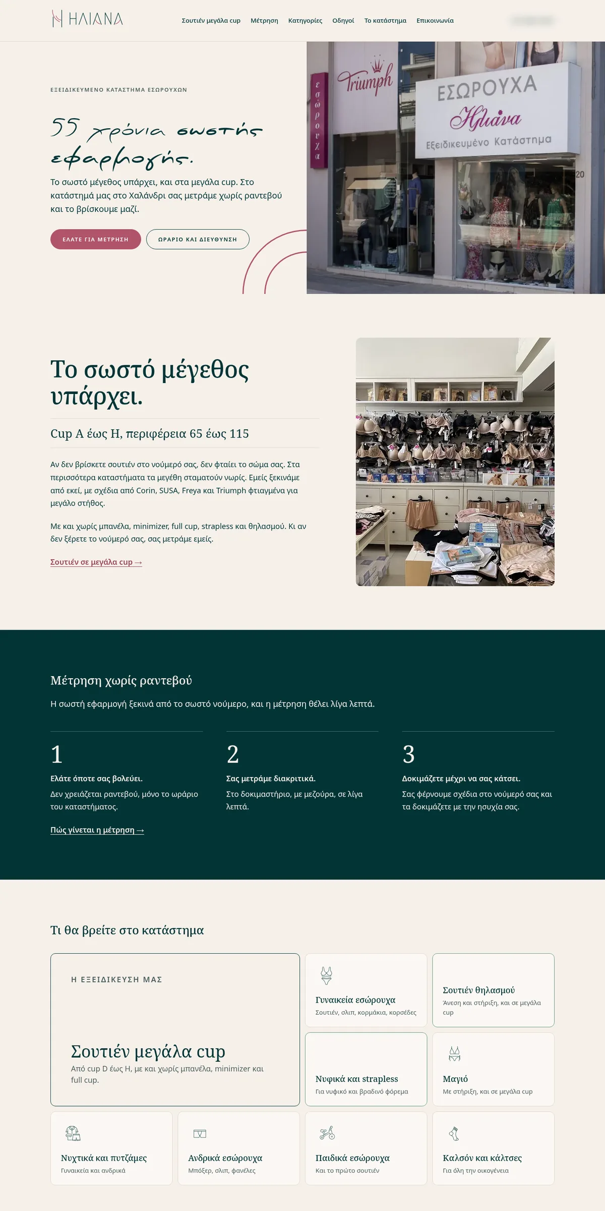
A lingerie shop in Halandri, Athens, since 1971. I made it an «Η» like a stage curtain (Η is the first letter of Ηλιάνα in Greek), the logo, the illustrations and the site.
One Η,
one curtain.
Two upright lines and two falling curves. Some people see a curtain opening on the shop window, some see fabric, others a strap. They all say the same thing: clothes that fit you just right.
Three tries.
How the Η sits inside the word: thinner, bolder, with a different curve. In the end the Η became a mark on its own, and the word kept the curve in its As.
The right fit,
in every size.
The shop's motto, applied to the logo: a version for every space, from the browser tab icon to the shop sign.
- XS favicon
- L stacked
- XL name only
- XXL horizontal
The palette.
The pink of the mark, a wine red for anything you can tap, a deep green that adds weight, and ivory instead of white. Cut with a dressmaker's pinking shears.
- Iliana pink #D94F70 the mark
- wine #B0546A buttons, details
- deep green #023436 text, backgrounds
- ivory #F6F0EA instead of white
- pink ivory #FAF5FA background for the mark
Six categories,
six drawings.
I drew them like a marker line, simple and a little tender, so each category stands out at a glance. On the site, they're the shop's icons.
- Women's lingerie a bra and briefs
- Swimwear a bikini with bows
- Nightwear & pyjamas pyjamas, and the sleep mask
- Men's underwear boxers
- Kids' underwear a little bike
- Tights & socks a sock
From the shop window
to the screen.
I designed ilianalingerie.gr: “55 years of the right fit” up top, the no-appointment fitting in three steps, the categories with their icons, and the curves of the Η as a pattern. goWebgo did the development.